Client: Startup, Switzerland
Role: UI, UX, Graphic Design, Research
Team: Project Manager, Designer (me)
Year: 2021
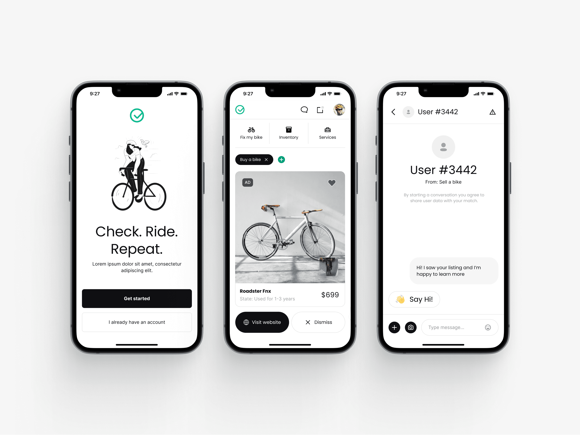
The project is meant to reimagine the way bikers cooperate. It targets athletes and bike enthusiasts alike and aims to improve the experience of owning a bike by helping them exchange their parts and fix their bikes.
The Problem
Professional bike ownership often comes with significant challenges, particularly when it comes to sourcing specific parts or finding reliable repair. Our initial understanding highlighted several key pain points:
• Difficulty in Sourcing Parts: Riders frequently struggle to find obscure, affordable, or readily available components.
• Cost and Accessibility of Repairs: Professional bike repairs can be expensive and inconvenient.
The research stage: Data-driven visual decisions
I conducted thorough research on the styles that best communicate the product, basing it on solid scientific foundations. One of the main areas of focus was color.
Science of color led me to a conclusion: More saturated colors demand more attention but cause an impression of lower quality. Another fascinating insight is that saturation and brightness matter more than hue for psychology. Source below.
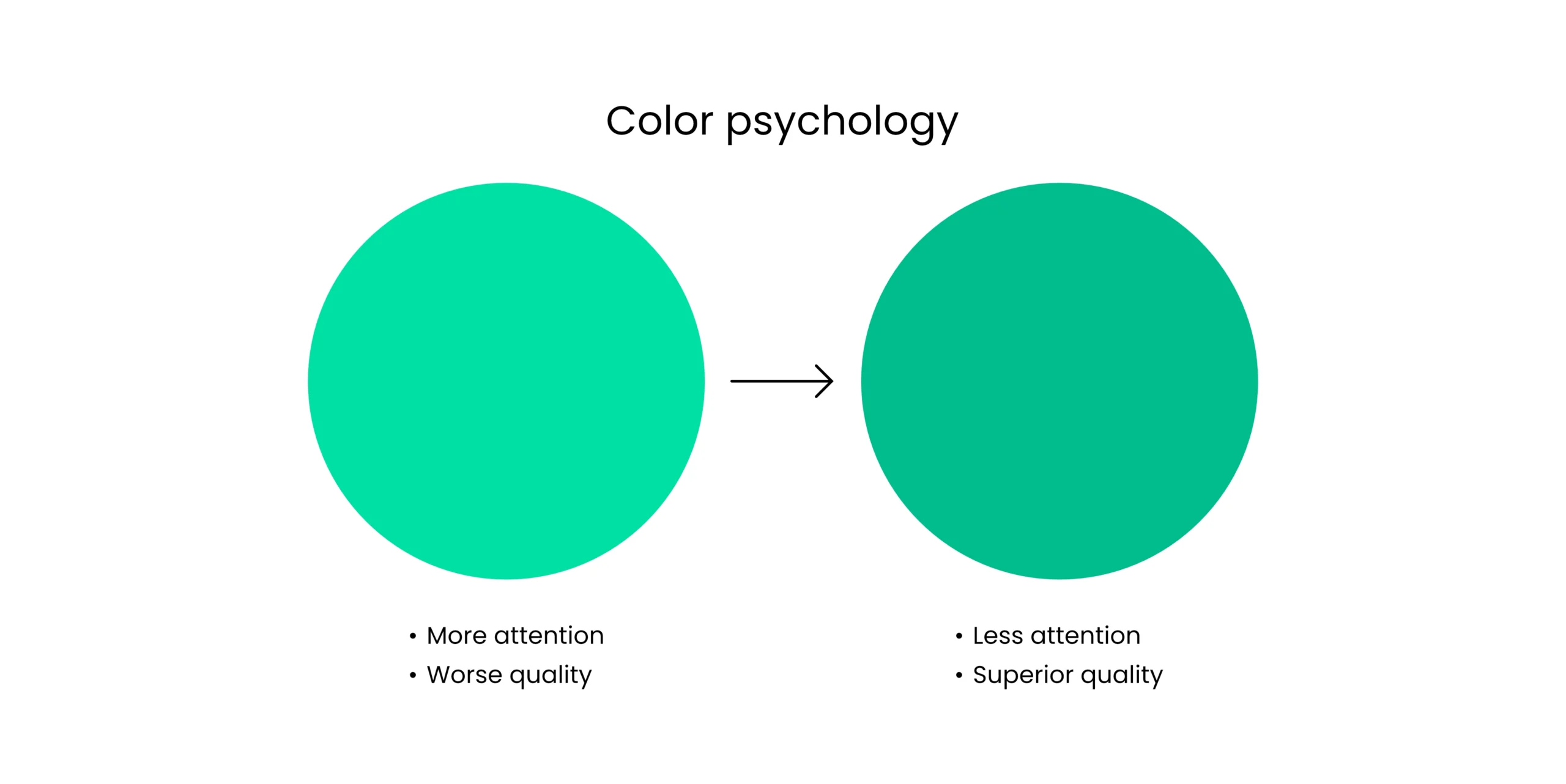
Wilms L, Oberfeld D. Color and emotion: effects of hue, saturation, and brightness. Psychol Res. 2018 Sep;82(5):896-914. doi: 10.1007/s00426-017-0880-8. Epub 2017 Jun 13. PMID: 28612080.
The color scheme proposals
After conducting fundamental research, I was ready to create the product’s color scheme. My two main ideas were:
Blue: Technology and trust.
Green: Nature and growth.
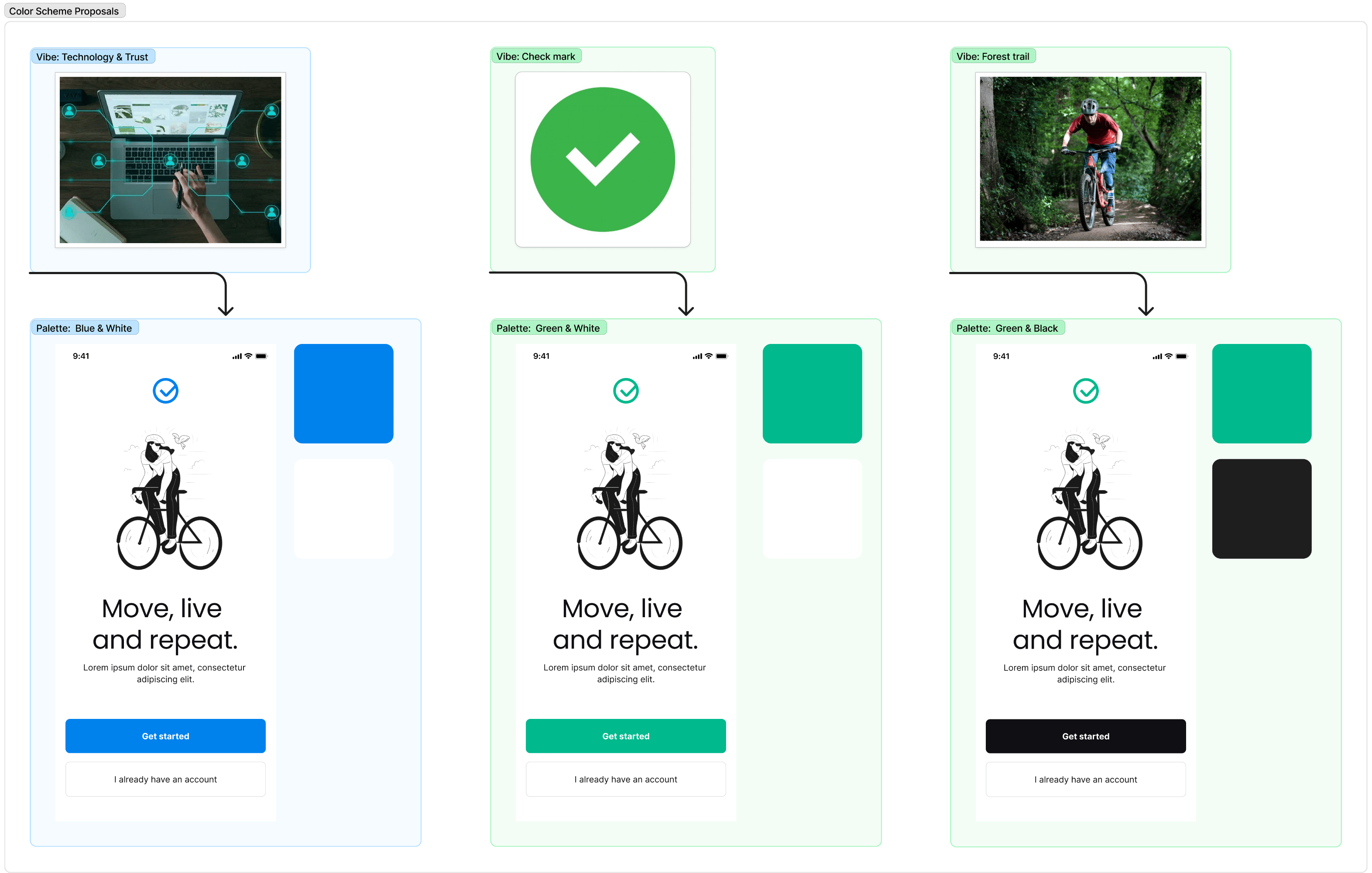
Talks with the client led me to the green and black colors. Green symbolizes nature and growth, aligning with our app’s mission to help bike enthusiasts repair their bikes. Black adds a professional touch, perfect for our professional target audience. And let’s not forget, bikes themselves are often black.
Final brand identity, a complex story told trough simplicity
The logo combines a circle and a checkmark to tell the brand’s story. The circle represents a bicycle wheel and the universal circle of life, symbolizing the repair and rejuvenation of a bike. The checkmark itself signifies a problem solved and a task completed.
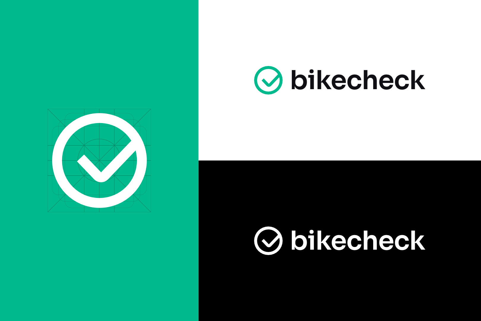
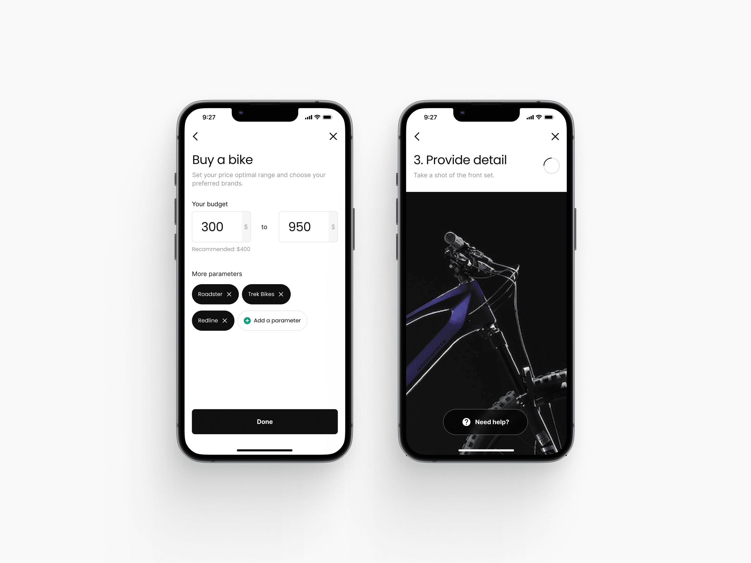
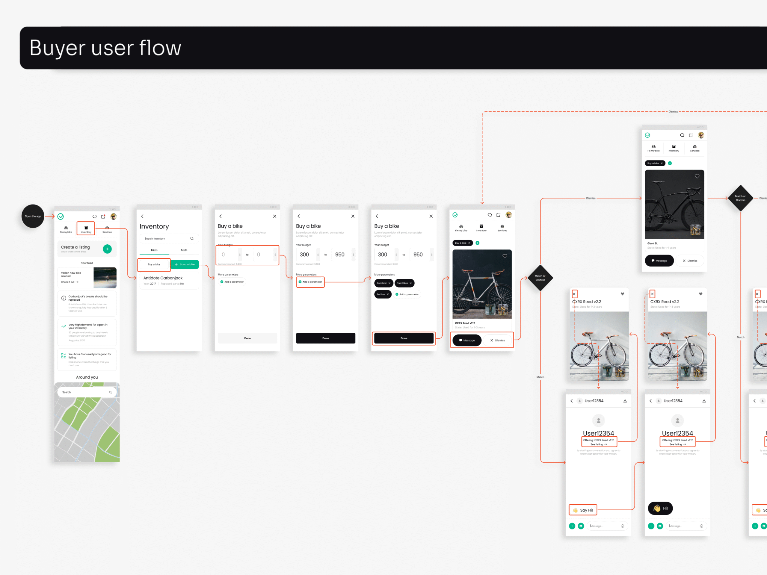
UI design stage
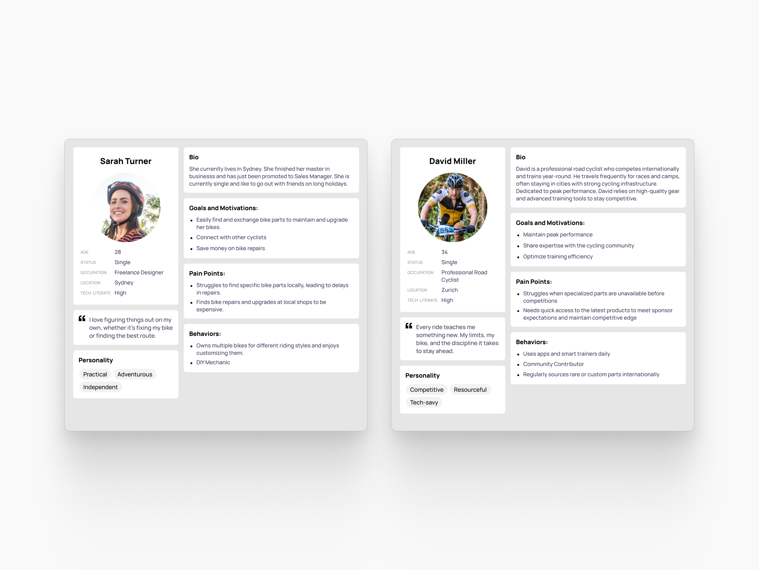
My earlier research findings were synthesized into core user personas, which then served as a strategic foundation for the subsequent UI design phase.
I built a “buyer” and a “seller” user flows, both of which were used for user testing and for client presentations.
The result
Final designs synthesized all the research and thought put into it during the preceding phases. The logic was tested, and even the details like color were based on research.