Client: Notive, Cupertino, United States
Role: UI, UX, Graphic Design
Team: Full-Stack Dev, Designer (me)
Year: 2021
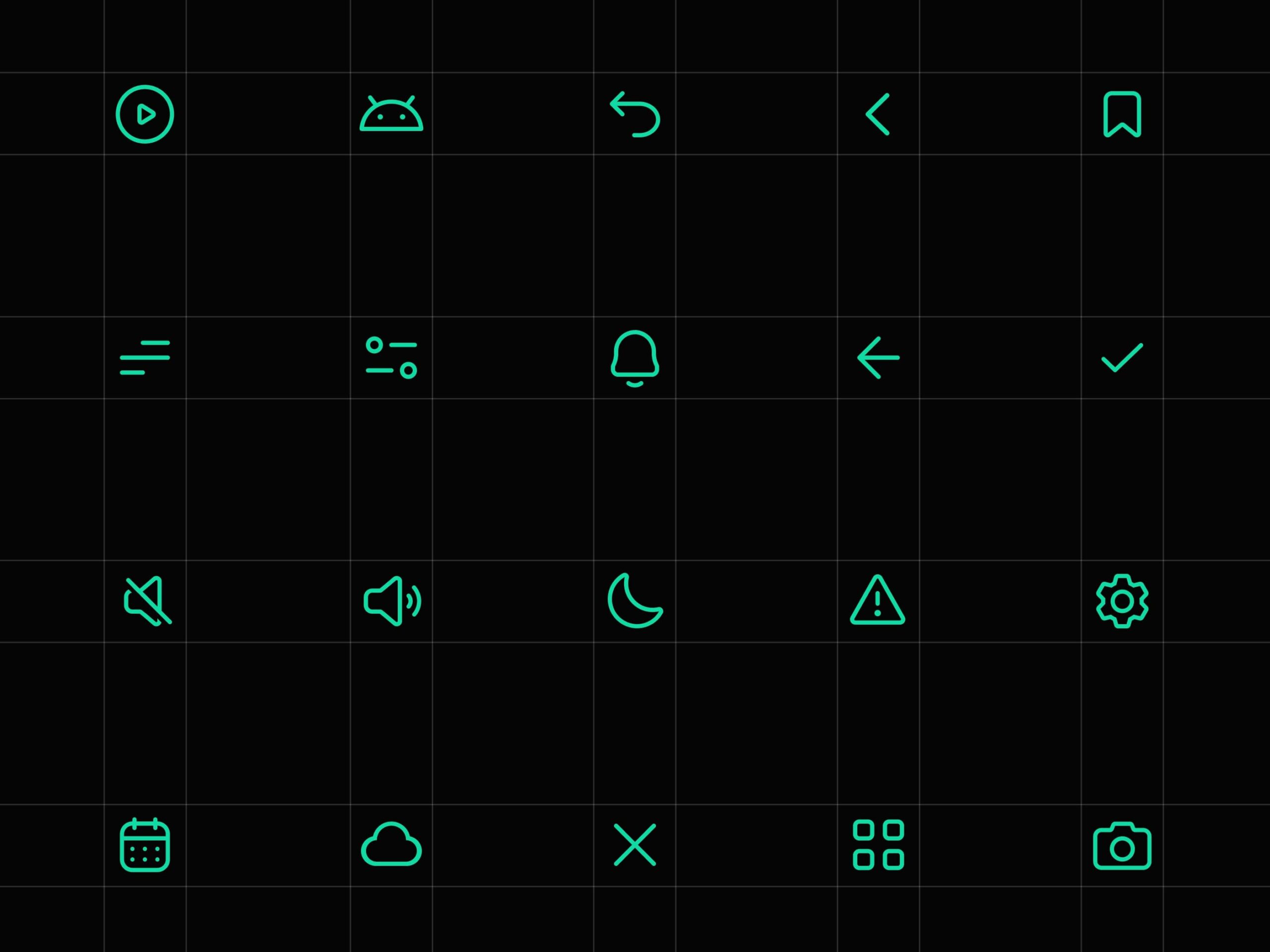
Notive is an android launcher and an app that aims to help you avoid distractions and stay productive through innovative notification management. I also designed the design system for the project, including the icons and illustrations. I was able to keep up with the deadlines and even finish before the deadline. The results thrilled the client, and he announced he would recommend me to his friends.
Design with grids and precision
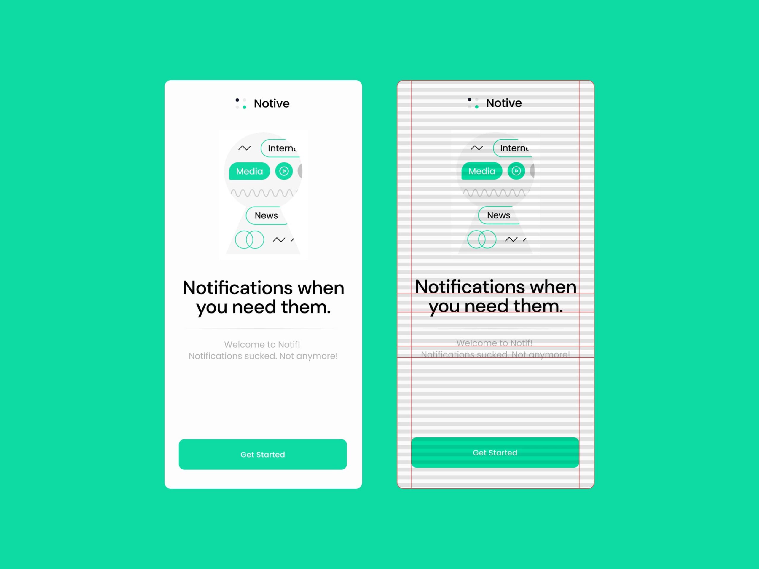
The app’s design was consistent, thanks to the 8px baseline grid. This grid is especially helpful with typography because it is way more precise than the default text bounding box. Also, it’s the first screen the user sees during onboarding. The large buttons and the large text make the UI easier to use and more inclusive for people with poor eyesight.
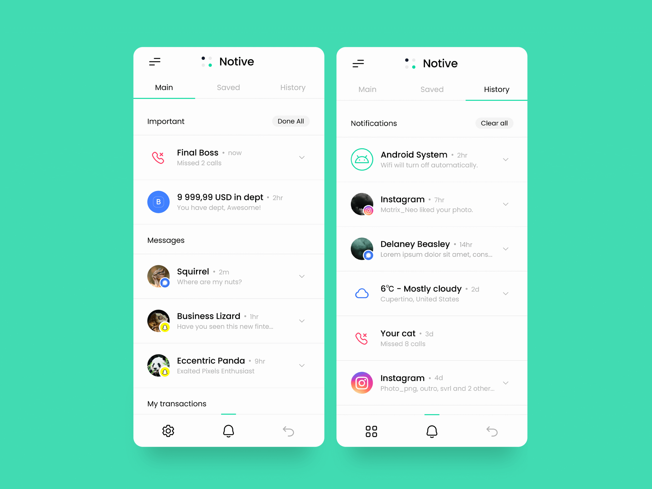
Main feed
One of the most difficult challenges I faced was designing the notifications feed. All notifications should be clean and minimalistic while displaying all of the information recommended by the Android developer guidelines. I also had to figure out a way to add the “save” and “done” affordances. The other notification feeds also had to be easily accessible from the main feed. After some trial and error, I finally arrived at the solution. I altered the notifications to be expandable and added the swipe interaction in order to accommodate the “save and “done” features.
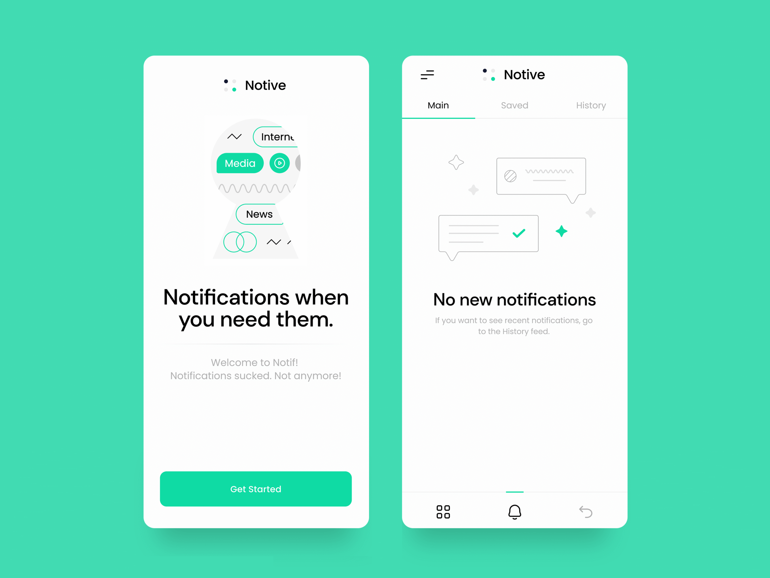
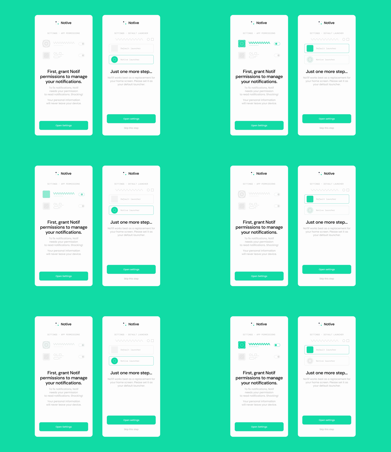
Animated illustrations and interactions
Abstract animations are made to guide the user during the onboarding process. We decided not to do a realistic animation because the settings may vary depending on the device. Instead, we decided to make the animations more universal. The design puts a huge focus on fun interactions.
