Client: Real estate broker
Role: UI, UX, Collaboration with the dev team
Team: Full-Stack Dev, Project Manager, Designer (me)
Year: 2023
The product’s primary goal is to enable users to buy and manage real estate located overseas, with a focus on holiday locations. My responsibilities were much broader than UI or UX design. I was also building a new product and a new brand.
My role
I was the sole designer collaborating with a developer, responsible for the project’s full design process, from product strategy and branding to UI execution. Every decision, from typography to breakpoints, was grounded in UX research and industry best practices. My focus was on aligning user needs with business goals through systematic thinking and clear communication with both client and developer.
UX research
We conducted thorough research, beyond just identifying users with personas, the research aimed to understand how users complete tasks by employing frameworks like Jobs to be Done (JTBD). Competitive analysis established the basis for unique solutions while ensuring we followed emerging industry standards
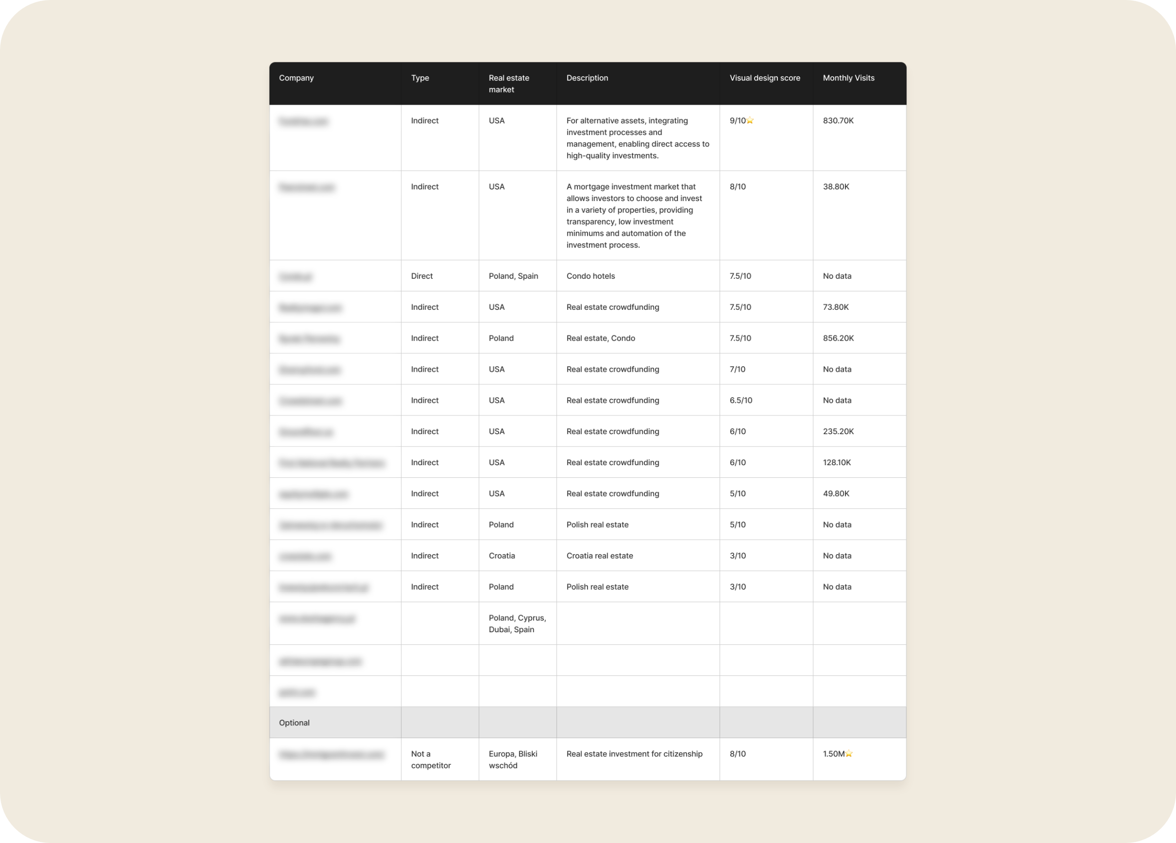
No detail was left without justification. All crucial UI decisions were based on our UX research. Everything, from the choice of fonts to the desired breakpoints, was precisely crafted based on our target group and best industry practices.
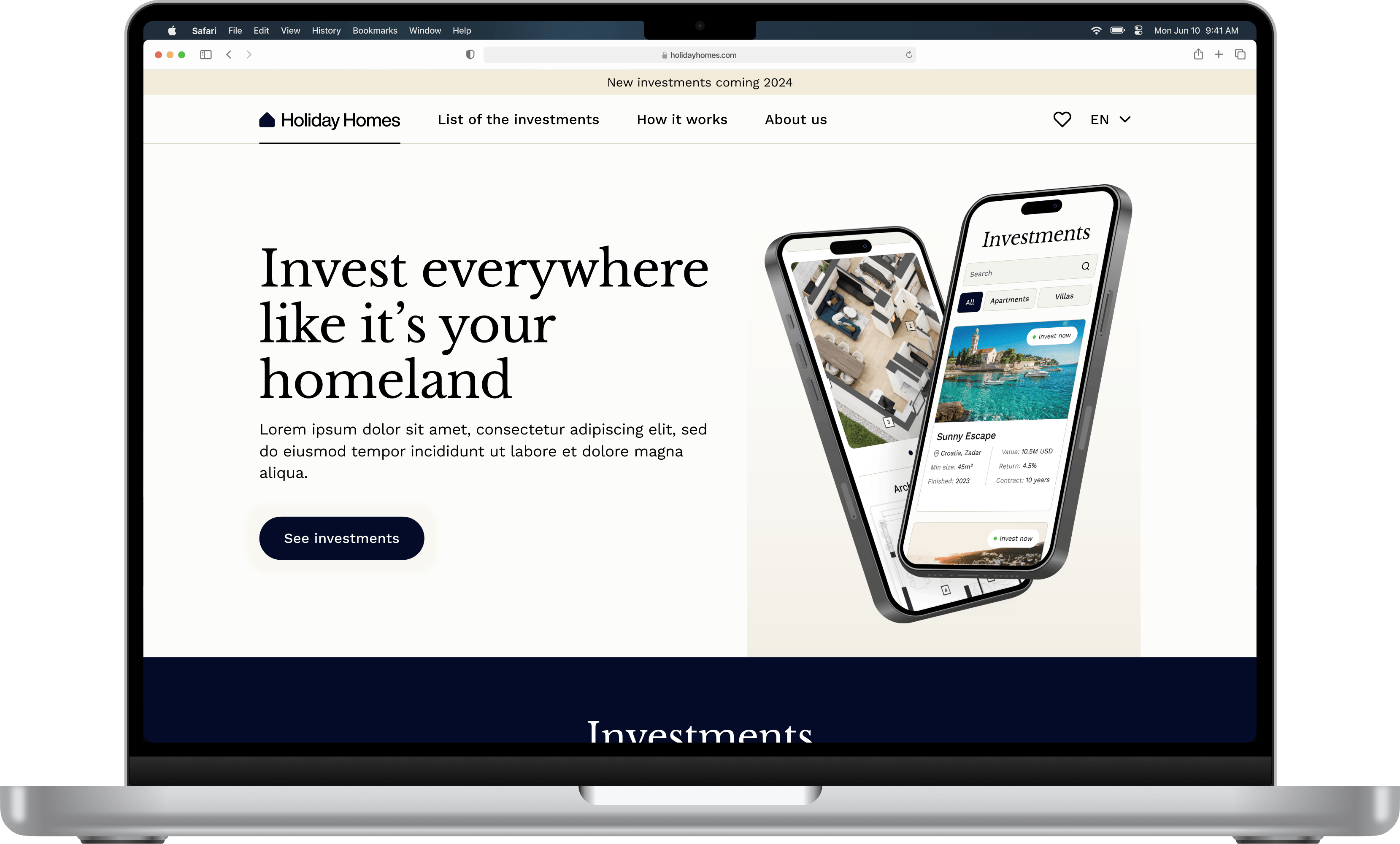
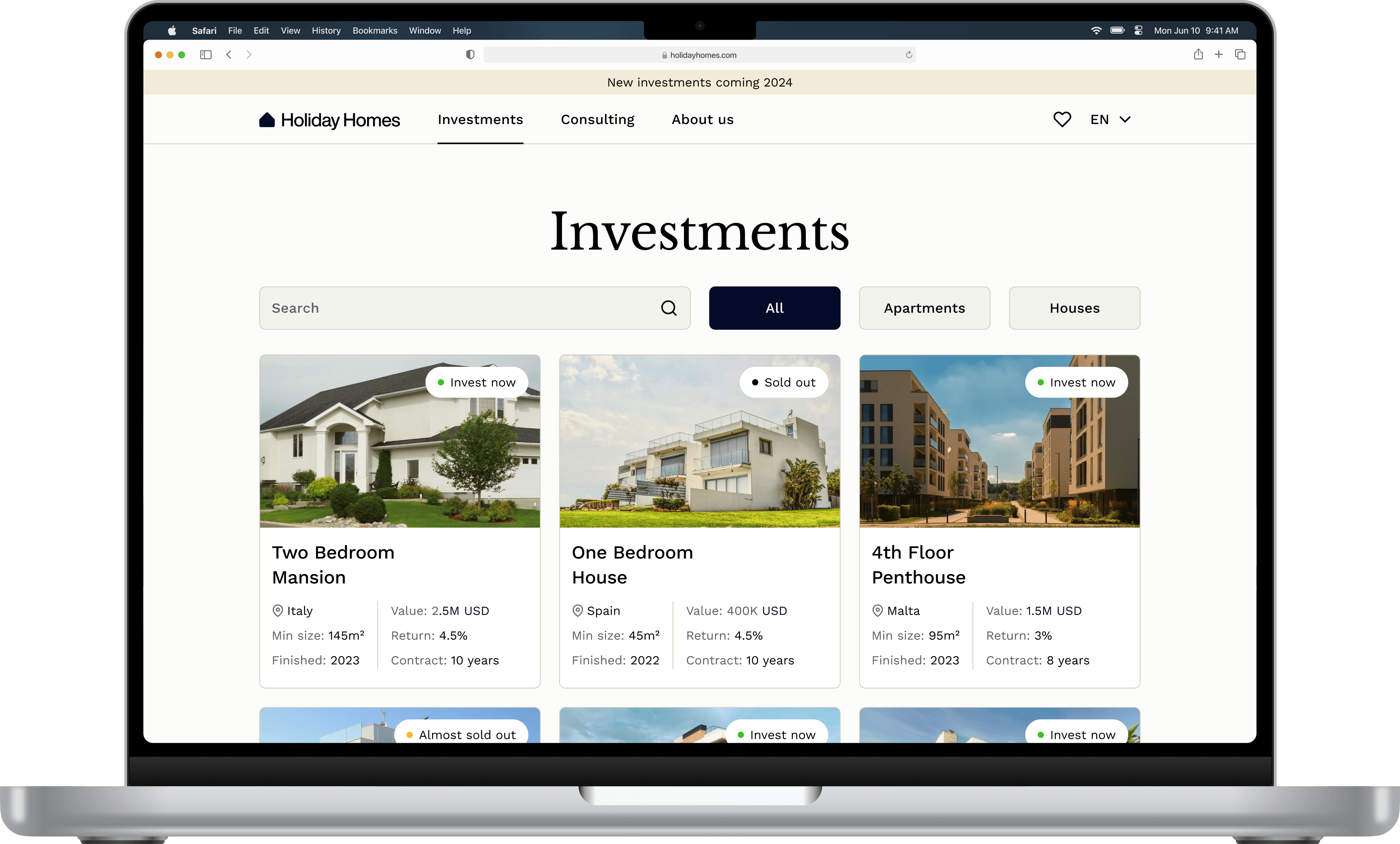
Building a platform from scratch
The client came with nothing but a vision and an empty sheet of paper. The fundamentals had to be built first. I used fonts and colors, with the goal of creating a unique and warm look, along with a professional business feel. This focus ensures the product is aesthetically appealing, functional, and distinctive. Furthermore, products that engage our emotions and inspire trust create significant value for customers and companies alike
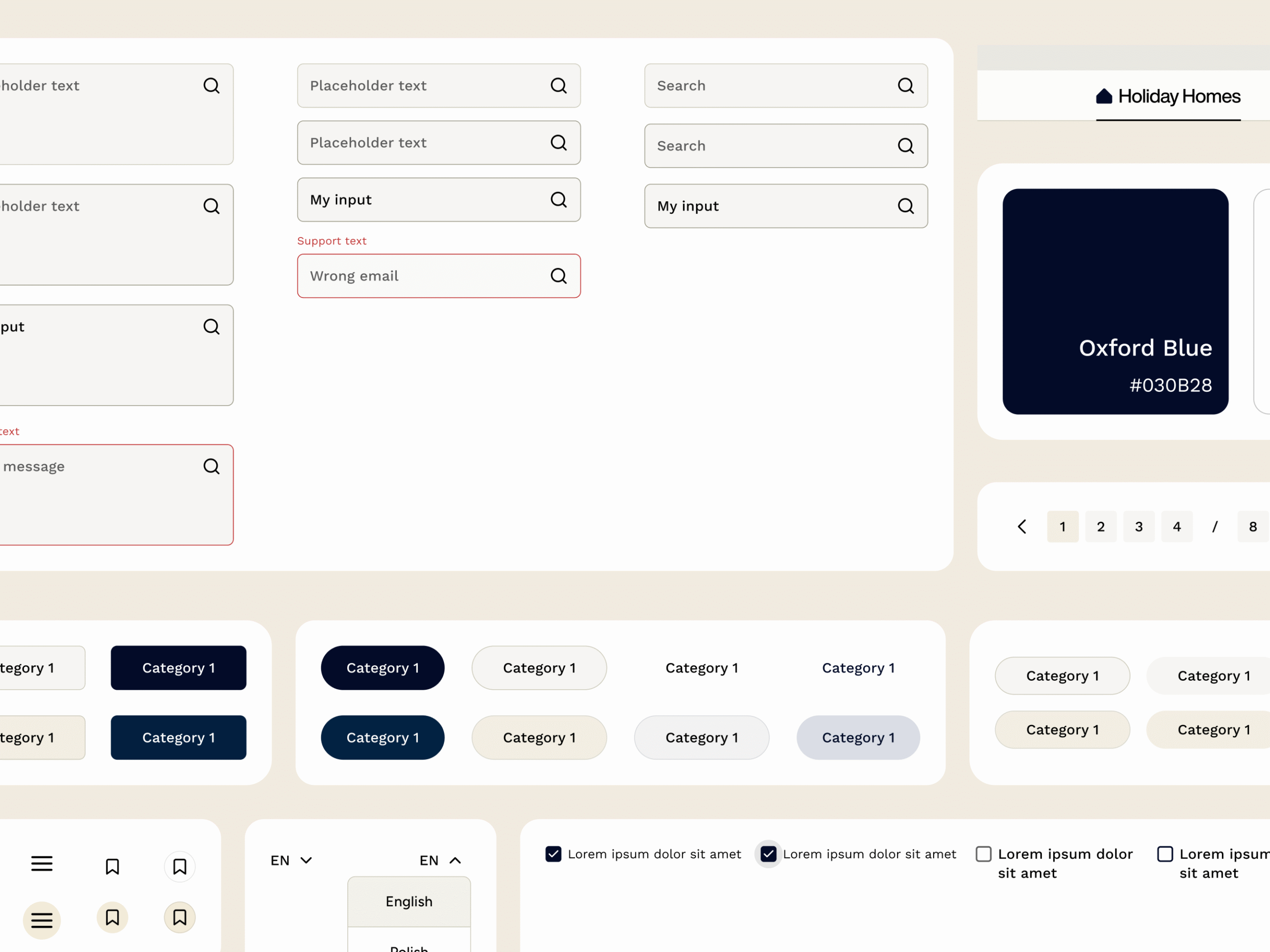
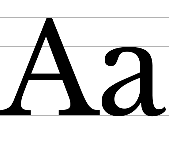
Typography as a language
After testing both sans-serif and serif font variations, I decided to go with a confident Libre Baskerville serif font family. This family was used in the headers to achieve the desired business look. For the body text, I chose Work Sans as a complementary font pair.
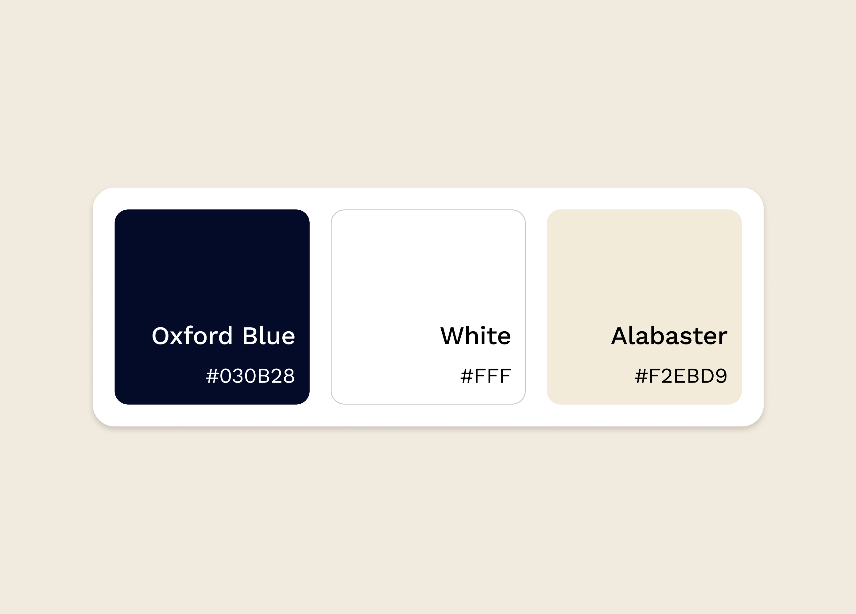
The color scheme
Oxford Blue was picked as the primary color because it is professional and intelligent. Blue tones commonly symbolize technology and trust, aligning perfectly with the needs of a financial platform. Since the product focuses on premium holiday locations, I paired it with Alabaster to add warmth and a bit of sophistication. This palette alignment directly supports the dual brand requirement: professional investment (Blue) and aspirational vacation luxury (Alabaster warmth)
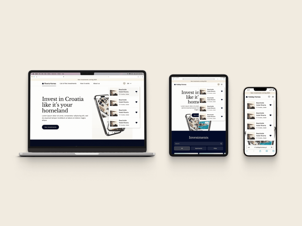
Breakpoints & Design System
I didn’t take the easy path to finding the most optimal breaking points for this project. I combined the data on the most common web devices with the insight of our target group. The result is a compromise that includes standard but high-end device dimensions used by our business target.